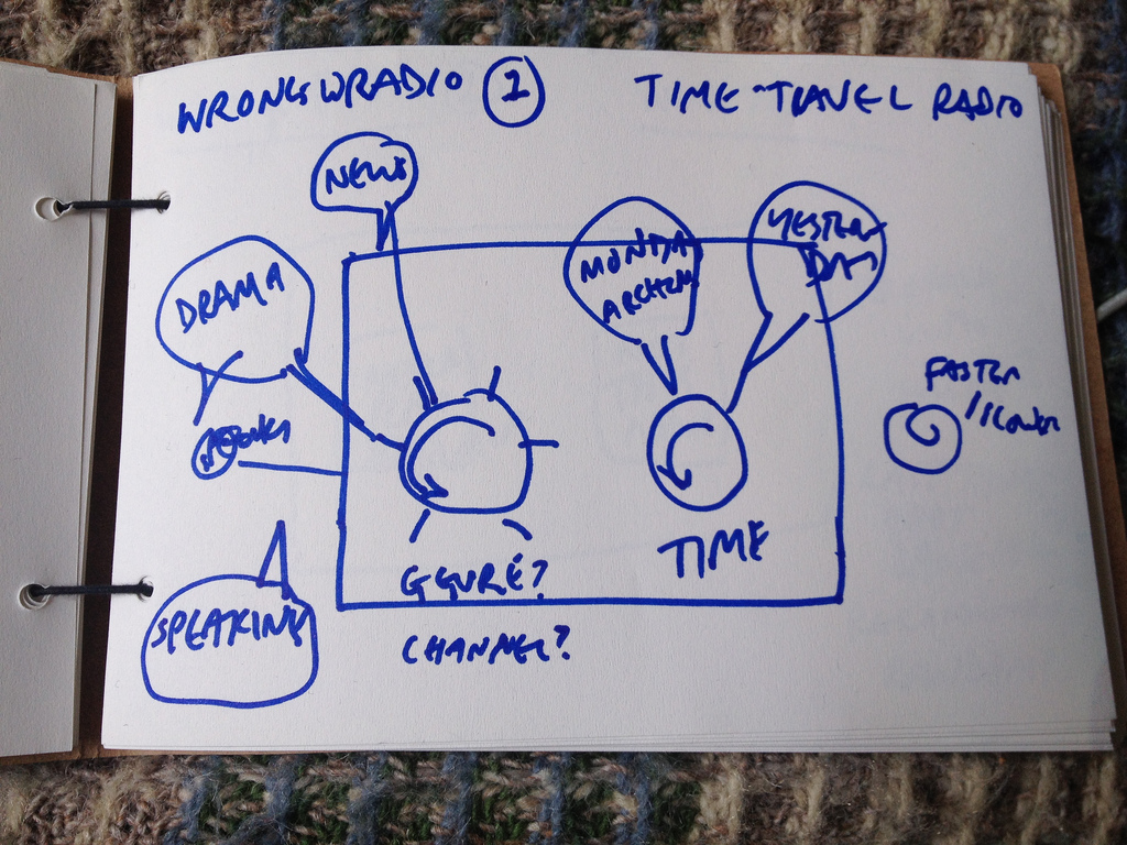
I had a very interesting conversation at Bristol Hackspace a couple of months ago. I was trying to explain what on earth I was trying to do and why. The Archers Avoider makes it easier than usual for me to explain what I do - often when I get asked I start thinking about it and then I’m not sure what on earth I am doing, and plunge into a confused and rambling description of the lots of stuff that I do at work. The Archers Avoider is easy to explain (“you press the button and it avoids the Archers”) and sparked a conversation with Richard, Anton and Ian started about the kinds of radios that they would like to see and I started drawing boxes and circles in a notepad.
I really like this way of working. You end up with a fluid back-and-forth about what it would do, and there’s something about having a picture that conveys what you are talking about in an engaging manner with an immediacy that’s lacking in a written description.

I don’t know why it works so well - these are scribbles really. @psd and @evalottchen do beautiful and engaging pictures but these are much more primitive. But it’s clear that for some reason drawing things is a good way of getting people to think about the ideas they have, and it seems like an excellent way of coming up with requirements for Radiodan. At this stage, the more features the better. I’ve been listening to In Our Time Science archive a lot recently, and I want a kind of Cambrian Explosion of ideas for radios (mp3).
Various conversations with Richard at the Hackspace and AndrewN of team Radiodan suggested that some people would be less keen on drawing these things themselves, and that some sort of a template would be useful. So we made some simple postcards and stickers at Moo.
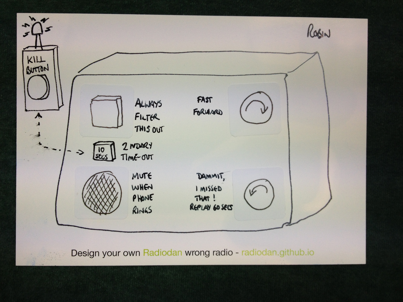
I then tried out the process at the XML Summer School. I was amazed at how well it went, and how enthusiastic people were about it, and at the lovely ideas that people came up with. You can see most of them in the Flickr pool. Here’s one of my favourites:

Robin / Philip: always filter this out; mute when phone rings; fast forward button; dammit I missed that; kill button on a remote and then a backup one in case you don’t make it there in time.
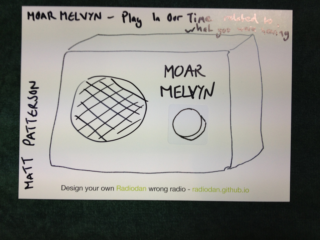
and another:

Matt: hit the button and you get something from In Our Time on the subject (there probably is something!)
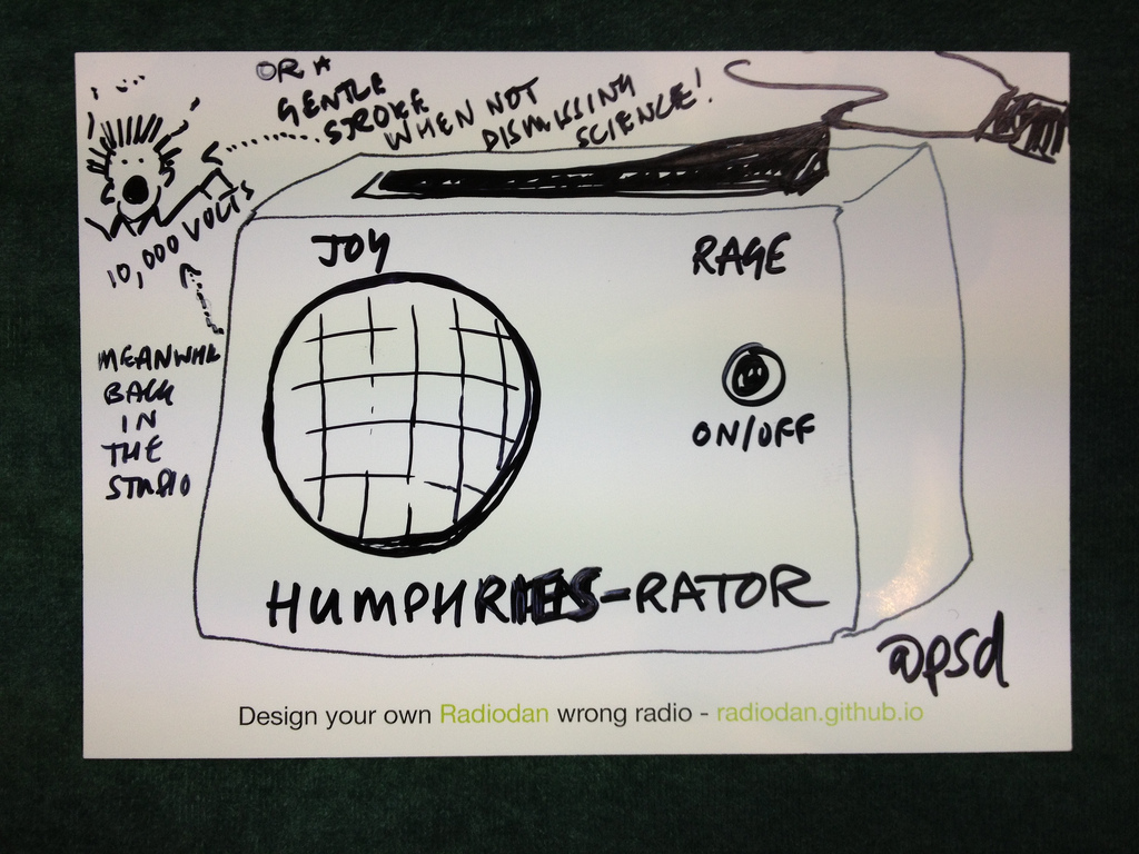
and another:

Paul said: “My radio is mostly fine - my only interaction is when John Humphries comes on - so this allows you to give him a stroke when he’s nice but give him an electric shock when e.g. he talks about science”
I’ve since run a similar event at the MediaScape project kickoff meeting, with equally interesting results.
This is the basic process that I’ve used:
In practice, people usually get the idea without much introduction at all (I’ve tried it in the pub and it works perfectly well :-)
The main idea is to give people some ideas and tools, get them enthused and interested, let them talk about their ideas, listen to them, and ensure they get credit. And somehow, in a way mysterious to me…it works. It’s fun and produces lots of interesting ideas.
I hope that we can run more of these sessions and for different kinds of devices. We’re at the stage now of starting to work out what we do with this information. It’s not clear to me if we should look for regularities - or outliers - or both. We’re getting some help from some user experience experts in the BBC on how best to do this, which is great.
For now, here are some clusters of interesting areas, things that keep coming up: